Designing the KnowThyself360 Visual System
How we built a design language for growth, reflection, and human understanding — without metaphors, cliches, or shortcuts.
Context
KnowThyself360 is a feedback and self-awareness platform designed to help people grow through reflection and shared perspective. Unlike traditional tools, KnowThyself360 operates in a deeply human space — where emotional safety, trust, and clarity are essential.
This meant the design system couldn't just be functional; it needed to feel safe, structured, and empowering.
The Challenge
01
No physical anchor
Unlike products like Instagram (camera) or Spotify (music), KnowThyself360 has no obvious visual metaphor.
02
Avoiding cliches
Mountains, bridges, horizons quickly became too literal, too "wellness," or too abstract and fluffy.
03
Balancing emotion & structure
The product sits between emotional vulnerability and structured growth. We needed a system that holds both.
Brand Strategy Foundation
To ground the design, we ran a structured brand exploration process.
Survey (Bias-free input)
Individual perspectives collected across the team before group discussion to avoid bias and surface authentic insights.
Strategy Workshop
Defined the universal truth, positioning, and emotional contract collaboratively.
"3 In / 3 Out" Framework
What we are: Forward-thinking, Ease, Seamless. What we are not: Cold, Corporate, Fluffy.
Emotional Contract
Users should feel: At ease. Safe. Empowered. Not judged. Not overwhelmed. Not analyzed.
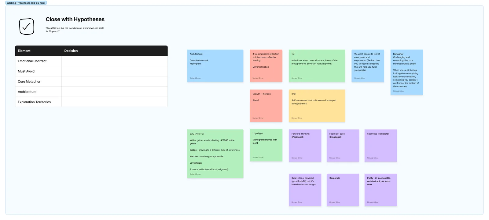
Metaphor Exploration
We explored multiple metaphors — Guide, Bridge, Horizon, Mirror — before arriving at a narrative: a challenging but rewarding hike with a guide. At the top, everything becomes clear — a perspective you couldn't access before.
Breaking Down the Truth
To move from words to visuals, we decomposed the universal truth into core components — each explored through literal meaning, human meaning, tension, and structural potential.
Driver
Change Catalyst
Creates movement from stuck to growth
Human Growth
Capability Expansion
The core ethos of the product
With Care
Protective Framework
The differentiator: safety + trust
The Turning Point
There was no single object or metaphor we could use without becoming cliche or misleading. Mountains were too literal, wellness visuals too soft, abstract systems too cold.
So we made a deliberate shift: from metaphor to system.
Visual Exploration
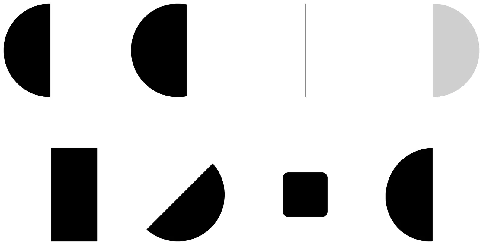
We began exploring using only circles, lines, and containers — focusing on growth over time, movement between states, and being inside a safe space.
Refining the System
We doubled down on three elements:
Nodes (States)
Represent the user at different stages. Size = growth.
Path (Transformation)
Movement between states. Must feel intentional, not decorative.
Container (Safe Space)
Inspired by brackets / reflection. Represents psychological safety.
Growth happens inside a safe space, through movement between states, guided by reflection.
Early Insight
User testing revealed the concept felt intelligent and intriguing. People saw "yin-yang," "balance," and "space" — but also flagged that some elements felt too abstract or accidental.
Logo Direction
We moved away from literal metaphors and developed a symbolic system built on circular logic (360 / completeness), dual states (current vs future self), path (transformation), and container (safety).
Avoided illustration — kept abstraction
Limited elements — clarity over complexity
Focused on relationships — not decoration
What We Built
This is not just a logo. It's a visual language system.
Rules
- Max 2-3 elements
- Intentional relationships
- No decorative forms
Behavior
- Growth = movement
- Feedback = connection
- Safety = containment
Typography
We selected Figtree — modern but not overused, soft and welcoming, avoiding corporate rigidity, supporting the system instead of competing with it.
Display
Aa Bb Cc Dd
Body
The quick brown fox jumps over the lazy dog. 0123456789
Outcome
Minimal but meaningful
Structured but human
Abstract but interpretable
It avoids cliche metaphors, over-designed visuals, and generic SaaS patterns.
[Graphic: Final brand system showcase — logo in context, color palette, UI examples]
KnowThyself360 doesn't show growth as a destination. It shows it as a process:
Inside a space. Between states. Over time.
What's Next
Defining visual style, motion & interaction
This is an ongoing process. The brand will continue to evolve as the product and our understanding of our users deepens.