Logo guidelines, variants, and assets for knowthyself360.
Introduction
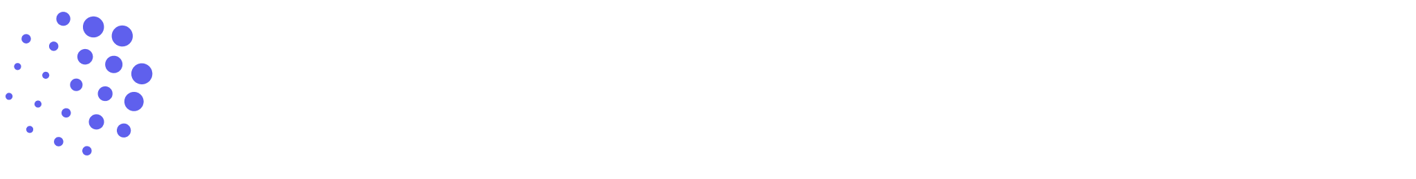
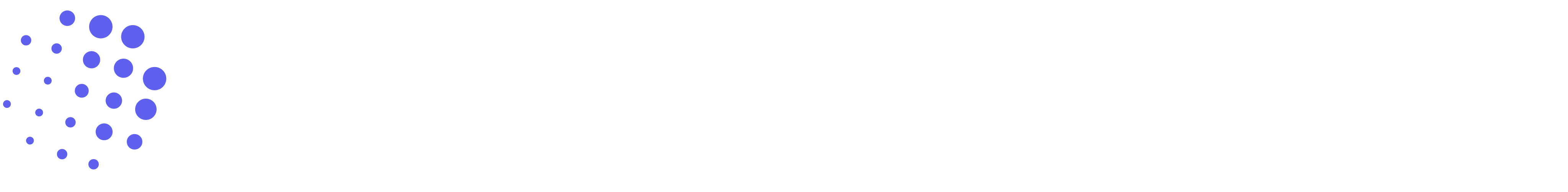
The KT360 logo represents growth through reflection. It is built around two core elements that work together:
Container
A safe space for reflection — the boundary that holds the process of growth.
Perspectives
The circles represent the people in your community. Your change impacts those around you — and circle sizes show how that change ripples and grows over time.
Growth happens inside a safe space, between perspectives, through shared understanding.
Tone & Expression
Calm
Intelligent
Human
Corporate
Cold
Overly playful
Color Versions
The logo comes in four color variants, each designed for specific background contexts.
Icon + Wordmark
Light Mode
For light backgrounds
Dark Mode
For dark backgrounds
Black
Monochrome — print and high-contrast use
White
Monochrome — dark backgrounds
Icon Only
Light Mode
Dark Mode
Black
White
Sizing
Each size is optimized for a specific context. Use the size that matches your surface.
Icon Sizes
Favicons, browser tabs
Navigation bars, compact UI
App icons, toolbar buttons
Profile pictures, feature icons
Card headers, modal icons
App launchers, large panels
High-res displays, print
Logo Sizes (Horizontal)
Compact headers, email signatures
Navigation bars, subheaders
Page headers, presentations
Landing pages, marketing materials
High Resolution
High-resolution versions (1024px and 2048px) are available for print, presentations, and large-format use. Download them from the asset browser below.
Structure & Spacing
Icon only
Icon + wordmark
Clear Space
Always keep empty space around the logo equal to the height of the icon itself. This breathing room protects the logo from competing elements and keeps it legible at any size. Never crowd it.
x = icon height — maintain on all sides. The faded logos show the minimum boundary; nothing should be closer.
Core Rules
- • Perspectives must feel related — they belong to the same community
- • Circle sizes are intentional — they represent scale of change, not randomness
- • The container defines the boundary of safety — never remove it
- • No element is decorative — all elements serve meaning
- • Relationships must remain clear in both static and motion use
Color Usage
Primary Purple
Growth, transformation, and the core identity of the brand.
Neutral Dark
Structure and wordmark — grounding the mark in clarity.
Color should support meaning, not decoration.
Allowed Variants
Icon Only
Small spaces, app icons, favicons
Icon + Wordmark
Headers, marketing, presentations
Monochrome
Print, embossing, single-color contexts
Misuse
The logo is a system. Protect its integrity by avoiding these common mistakes.
Don't distort or stretch
Maintain original proportions at all times.
Don't rotate or animate randomly
Motion must be calm, intentional, and guided.
Don't overcomplicate
One logo per layout. No stacking or layering of marks.
Don't use as decoration
Every element serves meaning. Nothing is a pattern or texture.
Accessibility
Every color variant is designed to pass WCAG AAA contrast on its intended background. Always match the logo variant to its correct surface.
light mode
White background · Primary — light surfaces
- ✓ Maintain strong contrast on all backgrounds
- ✓ Works on both light and dark backgrounds — use the correct variant for each
- ✓ Remains clear and legible at small sizes (minimum 16px)
- ✓ Motion should not reduce clarity or legibility
Motion
The logo system supports motion. Allowed behaviors include perspectives shifting position, signals appearing gradually, and the container holding space. All motion should feel calm and purposeful — never decorative.
Calm
Intentional
Guided
Chaotic movement
Decorative animation
Loss of structure
Download Assets
Browse and download all logo assets. Filter by type, color variant, and format.
104 assets
The KT360 logo is a system.
Simple. Intentional. Consistent. Recognizable — across all contexts.